User Experience Design Tips for Science Websites
User experience design tips for science, technical and pharmaceutical websites.
The pharmaceutical and life science industries, from a digital marketing perspective, has often found itself lagging behind other industries.
This is the case with websites in general in this respect.
The industry has been slow to adopt new digital techniques and trends. But the pharmaceutical and life science professional is evolving, and the website user experience, to effectively speak to that professional, is becoming hugely important in an ever-increasing competitive world. The corporate science website is now a key channel.
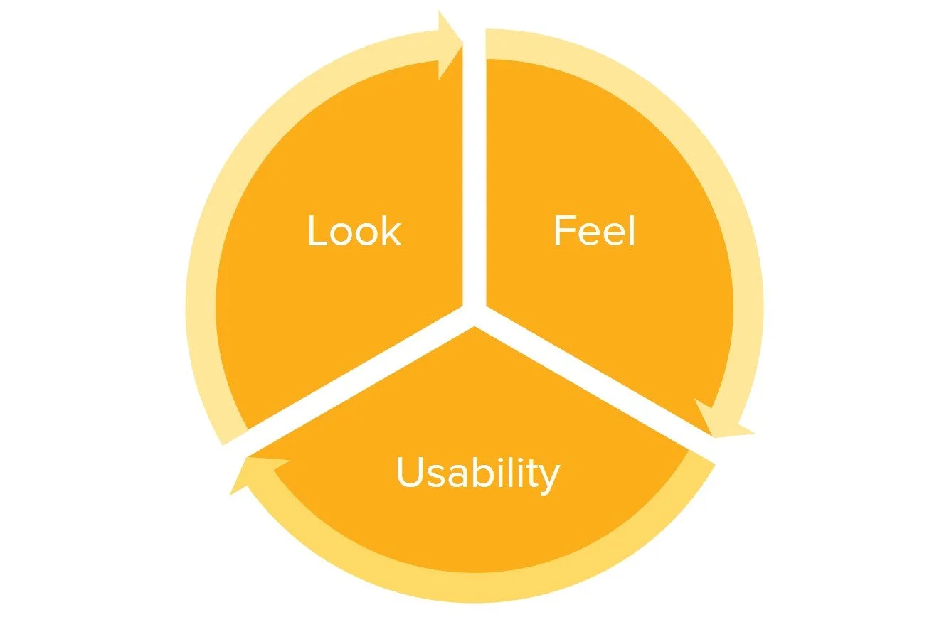
Now it’s time to design for the user and look to build trust with that website user. To do this, we look at the science website in the context of three key elements which form to create the optimal website user experience:
Look: Credibility, trust and consistency.
Feel: Interaction and reaction.
Usability: Functionality, individuality and predictability.
Subscribe for marketing insights via email
10 USER EXPERIENCE DESIGN TIPS
You have on average 10 seconds to impress your website visitors. Not a second can be wasted, unfortunately. In the quest to create a great website experience - by addressing its look, feel and usability - here are 10 website elements that can be tweaked immediately improve the science website's user experience and keep that user engaged with your content for longer.
These tips are relevant for both large and small science-based organisations with the aim of making the science website easy and pleasing to use.
1. IMPROVE LOAD TIME
Slow loading websites and web pages are the web’s biggest sin. It is the first element of your website that a visitor interacts with and is the first chance to create that seamless user experience. Optimal page load time is between 1.5 to 3 seconds – anything higher puts your conversions at risk because people will not stay around to wait for content to load. Google states that 53% of users will leave your science website if it takes longer than 3 seconds to load. If your site is slow: Reduce content, optimise images, enable browser caching or increase your server/hosting capacity.
2. IDENTIFY YOUR 404S
It is likely your website has been live for a number of years and during this time it is also likely that your organisation has created web pages for webinars, news and other events that have now expired. If these pages were simply deleted after the event, it is likely that referring links will point to a broken 404 page. 404 pages are not a great example of good user experience. Identify your 404s and set up redirects to other pages on your science website (or create a 404 page that provides a multitude of options to get back on track) so that user journeys on your website do not come to a halt.
3. ENSURE THE SITE IS RESPONSIVE
Once again, a highly obvious recommendation but there are still science websites that are not mobile responsive. These poorly designed websites do not provide an optimal user experience and InVision state that 85% think that an organisation’s website should provide a better experience on mobile than on desktop. Of course, we operate within B2B markets where the majority of our visitors will come from desktop. But this is no excuse with 2020 on the horizon. Your science website should operate effectively across mobile and tablet devices, if not, a redesign is in order.
4. SIMPLIFY THE NAVIGATION
The bounce rate on your homepage is a great indication of how well your science website and subsequent content is structured. If the bounce rate is high (50% and upwards), it may be time to rethink your navigation. Often, website visitors find an organisation’s website complicated to navigate, resulting in a bounce and that visitor never returning. To avoid this, look to make your navigational options as simple as possible and avoid cramming long lists of pages on to menus. Categorise the content on your science website and offer them on sections of the website in different ways to help ensure a positive user experience.
5. MAKE ALL WRITTEN CONTENT DIGESTIBLE
All website text should be easy to navigate, read and understand. Regardless of the subject area, this is actually easy to achieve just by editing the presentation of current content. Crazy Egg state that increasing white space on a page increases user attention by 20%. If your science website text does not sit on a white background, change it as soon as possible. Also, be sure to use titles and subtitles for your text sections and break up the paragraphs into short sections. Bullet points are also your friend, along with any presentation styles that present information to visitors quickly and efficiently.
6. KEEP WEB PAGE DESIGNS CONSISTENT
Once website visitors have familiarised themselves with your unique method of content presentation, any other presentation forms (that conflict) will have an adverse effect on the user experience. You do not want website visitors to question whether they are still on your science website after clicking through to a different section. Ensure your pages are all designed to follow a common pattern. Templates are often used to keep pages consistent; just make sure these templates are also consistent with your brand guidelines.
7. HYPERLINKS
Hyperlinks are another website element I often see science websites getting wrong. Of course, it is necessary to include similar content on web pages. Should a visitor want to find out more about a particular topic, he or she can do so easily by clicking on links without searching for it. But ensure that the hyperlinked text is clearly identifiable – underlined or via blue text is the most common approach that users will understand.
It is also best practice that most hyperlinks open in new tabs so the visitor can keep reading the original content, this is certainly the case on blog pages where links are common and especially if the link points away from your website to another. Where the link can open within the same tab (and potentially disrupt the current experience) is if the links are at the bottom of the page or if the user has followed a direct action to progress the experience with your organisation and website (such as clicking through to the contact details page), and are, of course, pointing to other pages on your science website.
8. KEEP AN EYE ON SEO
Search engine optimisation (SEO) might not come as a priority to marketers operating within the pharmaceutical, life science and other technical organisations. But if you are following SEO best practices with your website design, you will be adhering to Google’s guidance, which will not only refer to the best possible user experience practices but will also ensure you have the best possible chance of attracting more organic visitors to your website. Poorly designed science websites will not rank highly on Google because they are usually not designed well.
9. SECURITY
Every website, regardless of whether the website is brochureware or e-commerce by nature, needs to be secure. A secure website will almost certainly safeguard an exceptional browsing experience for the user - no visitor should be invited to a website that isn't secure. Attaining a security seal is also advisable, from the SSL certificate to the payment assurances on key conversion pages to the opt-in forms in terms of GDPR. DesignAdvisor found that 20% say that security concerns are the main reason they don’t buy and take action from mobile or e-commerce websites.
10. DON’T MAKE ME THINK!
This is the title of Steve Krug's famous book on web usability and human-computer interaction. If you have not read the book, make reading it the final task (or even the first, before you implement the tips) on this list. The premise is simple: A good website should let users accomplish their intended tasks as easily and directly as possible without deliberation. Nothing on your science website should need explaining (despite the complexity of your organisation's products and services), everything should be intuitive. If elements of the website appear complex or confusing to you as the administrator of the website, it needs revising, as your users will experience more confusion than you will.
DESIGN YOUR WEBSITE EXPERIENCE FOR THE USER
Remember that your science website is there to inform your users about your products and services; your organisation's website is not there for you as an internal team member of that organisation. Simplicity is key. Use pre-designed templates and build an educational website without compromising on design.
Spend time understanding your users and define a purpose for the website. These users will appreciate quality, but they are also impatient and prone to scanning pages and content. They also want control and will follow their intuition. With this said, always design with those users in mind. In our cases, the science professional is busy, but also very attentive to detail. So this is potentially a difficult task.
Start with your homepage. Jump into your Google Analytics account and investigate your average time on page and bounce rate, before moving on to landing pages and behaviour flows. The clues are there as to whether your science website provides an effective user experience or not.